ROLE:
LEAD UX DESIGNER
TIMELINE:
2025 - ONGOING
TEAM:
NARWHALS
PLATFORM:
RESPONSIVE WEB, MOBILE-FIRST

One system behind four pillars of Fidelity's Financial Wellness
Consolidating 19 aging pages into four coherent topic pages on a template built to flex, so people get one consistent place to build confidence, and the team ships the next page without re-litigating the last.
about
People come to Fidelity's platform to learn about financial wellness and get their bearings before they act. What many of them found was content up to a decade old, written against a model of financial wellness the company had long since moved past.
I joined after the first page had already shipped as an MVP. The brief was to keep producing the rest. I argued the real deliverable wasn't more pages, it was the system underneath them, and led the work that consolidated 19 legacy pages into four coherent pillars on a template built to scale.
For confidentiality reasons, I have omitted or generalized certain business metrics and internal data throughout this case study.
context
A decade of content the hierarchy had outgrown
Fidelity's Financial Wellness Topic Pages are article-style landing pages, one for each pillar of the company's Financial Wellness Hierarchy: Spending, Saving, Debt, and Protection. They're where someone goes to learn and get their footing before taking a financial step.
The trouble was the content behind them. Roughly 19 pages had piled up over the years, some more than a decade old, written against an older model of financial wellness the company had since replaced. They no longer matched the hierarchy Fidelity actually used, or what people came looking for. For someone trying to steady themselves before a money decision, stale guidance is worse than no guidance. It spends the trust they arrived with, the opposite of the confidence the page exists to build.
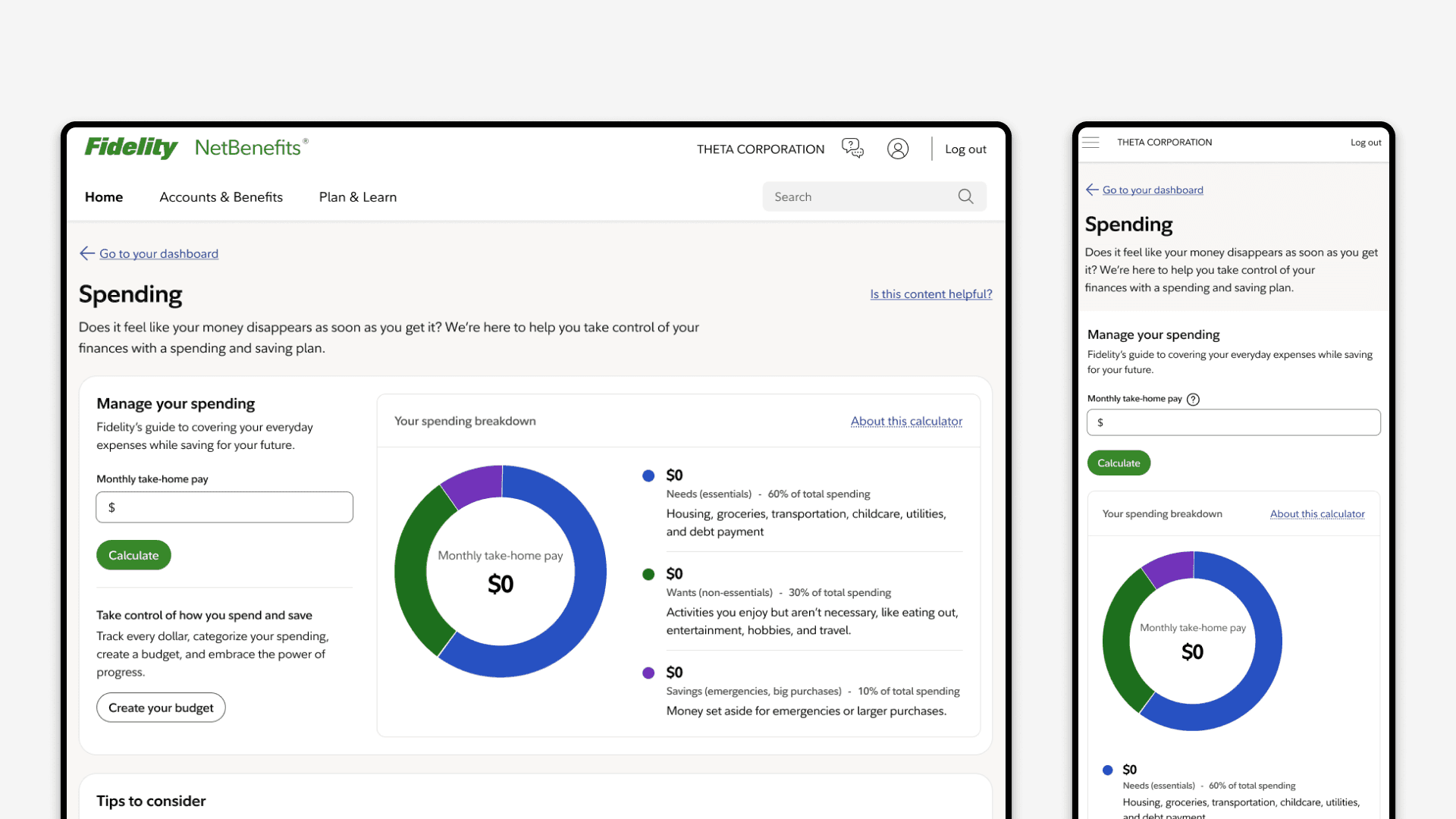
The first replacement page, Spending, had already shipped as an MVP by the time I joined. Built fast and deliberately streamlined to give developers direction, it did its job as a starting point. But it was a one-off: structure decided page by page, depth and flexibility traded away for speed. Four pillars built that way wouldn't hold together.

the challenge
Modernize a decade of content, make it interactive, scale it across four pillars
The ask from stakeholders and product owners had two halves. The content had to come current, mapped to the financial wellness hierarchy and to what people actually arrived looking for. And it couldn't be static. Leadership wanted the pages to do something, to give people a reason to engage rather than read and leave, which meant building interactive widgets into them.
Underneath that sat the backlog: four pillar pages to deliver, 19 legacy pages to retire into them, and a team newer to this kind of work. The obvious path was the one the MVP had taken, build each page and each widget as its own thing. That was the trap. Done page by page, the four pillars would drift apart in structure and interaction, now with inconsistent interactivity layered on top.

the reframe
From "more interactive pages" to one system that scales them
The brief read like two separate asks: modernize the content, and make it interactive. Taken at face value, the work was a production queue, four pages, a widget on each.
The closer I looked, the more those two asks were the same problem. Interactivity is precisely the kind of thing that fragments when it's built one page at a time. One page floats its widget above the fold, the next buries it. One leans on a heavy green call to action, the next a quiet white one, and nobody can say why. Build it that way and you don't get four pages, you get four dialects, the same drift that left Fidelity with 19 legacy pages to untangle.
So I reframed the work around the layer underneath: Instead of producing pages, build the system that produces them. One flexible template where interactivity, hierarchy, and calls to action are decided once and reused, so every pillar reads as part of the same family and the next page ships without re-deciding the last.
That frame turned the interactivity requirement from decoration into structure. The widget became a first-class slot the template was built around, fixed above the fold because that's where engagement happens, and the call to action became a rule that flexed instead of a fixed style. Decide those once, document how they flex, and the system carries the consistency the legacy pages never had. It also set up everything after it, the system first, then each widget built and documented as its own use case on top of it.
the resistance
Why redesign the page we just shipped?
The reframe was an easy sell on a slide. The hard part was who I was selling it to.
By the time I proposed the system, the team had just shipped the Spending MVP. It worked, it was built on FDS, and from where they sat the next move was obvious: take that page and stamp out the other three. What I was proposing looked, at a glance, like redoing work they'd just finished. The question came back fast and fair: why design something different from the page we just built?
It was hard to answer precisely because the two pages looked so close. The MVP and the system I was proposing drew from the same FDS components, so side by side the difference read as cosmetic. It wasn't. The MVP's element order was shaped to ship one page fast, not to hold the interactive widgets the roadmap depended on. The widgets that would define every future page had nowhere to sit in it. Extending the MVP as-is wouldn't have scaled the work, it would have locked in a structure that couldn't carry what came next, and we'd have rebuilt all four pages later instead of building the system once.
So I argued it on the structure, not on taste. Framed as a structural problem rather than a visual preference, the question stopped being whether the new pages should look different and became what they had to be built to carry.
I proposed it as a documented template, with the rules for hierarchy, interactivity, and calls to action decided once and built to flex, so the next person could pick it up without re-deciding any of it. Chapter design leadership backed it as the standard, and the post-MVP pages, Protection, Debt, and Saving, were built implementing that system rather than reinvented one at a time.
The proof wasn't a slide. It was all four pillars on one system, the Spending page that started the argument rebuilt onto the same template as the three that followed.

the system
What the template decides Once
With the system backed, the work was settling everything once so no page had to settle it again.
Structure that follows the hierarchy. Page order tracks the financial wellness hierarchy, not each author's preference, so every pillar opens with the same logic and a returning user always knows where they are.
An interactive slot, above the fold. The template fixes an interactive widget at the top of every page rather than below the article. Journey Workspace had already shown the pattern: people engage when something interactive is visible the moment they land. The slot is the first thing the page does.
A call to action that flexes by weight. Its weight shifts by page and by the widget beside it, a heavier green when it needs to lead the eye, a quieter white when the widget is already holding attention. The rule travels from page to page; the color doesn't. This drew the most questions, the "why isn't it green?" ones, and the answer is that a button that's always loud stops leading anything.
Room to flex without breaking. Each pillar carries different content and different widgets, so the template was built to bend, and documented so a designer or developer could see exactly how far it bends and where it holds. That's what let Protection, Debt, and Saving ship on the same bones without four separate conversations.
One family, on FDS. Built on the current FDS, the four pages read as one system and stay maintainable across the Financial Wellness ecosystem around them, the Dashboard, FW Checkup, and the rest.
The widgets themselves, what each does and why, are their own story, told elsewhere. Here they matter as evidence: drop a different one into the same slot under the same rules, and the page still holds. That's the system working.

impact
From Nineteen Pages to One System
The clearest outcome is structural. The redesign consolidated 19 aging pages into four pillars, all of them running on the same template and mapped to the financial wellness hierarchy the old content had drifted away from. A decade of sprawl became a system the team can keep building on.
The system did what it was built to do. Spending was rebuilt onto the template, then Protection, Debt, and Saving were designed onto it, each shipping on the same bones instead of from a blank page. What had been a per-page negotiation became a documented standard, so the next page started from settled rules instead of a blank one.
It also kept the work connected to the wider ecosystem. Every page shipped #builtwithfds, holding the four pillars consistent with the rest of Financial Wellness, the Dashboard, FW Checkup, and the tools around them, instead of drifting off alone the way the legacy pages had.
The real measure of this work isn't an engagement number. Page-level readouts compare the old Spending experience to the new one, and that measures a page, not the system I built. What the system changed is how the work gets made: four pillars that hold as one family, and new interactive use cases that drop into slots already built instead of getting designed from scratch. No single metric was going to capture that, and building the system first is what bought it.

reflection
What I took away
The system was the easy part. Designing a template that flexes is a solvable problem. Getting a team to rebuild what they'd just shipped, over a difference that looked cosmetic, is the one that took real work. Systems thinking is mostly persuasion, and a design is only as good as your ability to get it adopted.
Small questions are how trust gets built. On a newer team they kept coming. "Why isn't the button green?" "Didn't it used to look different?" I learned to treat each one as a chance to make the reasoning visible rather than a delay to push past. Answering them without shortcuts is what turned the design system from a mandate into something the team believed in.
Make your lead effective in the rooms you're not in. I kept my chapter lead briefed so she could carry the argument into leadership conversations I wasn't part of. Visibility wasn't the point. Work like this travels further when someone with more altitude can speak to it without you there.